CoPlot Home Page
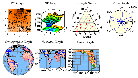
CoPlot's Graph Objects
(plot data and functions
on XY, 3D, triangle, and polar graphs,
and on orthographic, mercator, and
conic maps)
Great Scientific Graphs
CoPlot's graphs have many features which were
designed specifically to meet the needs of scientists and engineers, including
These are described and illustrated below. Since
graphs are one of the standard types of drawing objects in CoPlot, you can put
as many Graph objects on a drawing as you want.
CoPlot Home Page
| Top
7 Graph Types
CoPlot has 7 basic graph types: XY, 3D, Triangle, Polar,
Orthographic, Mercator, and Conic. On each graph, you can plot as many datasets
and functions as you want. A legend is generated automatically for the graph,
but you can control its location and appearance.

- XY Graph - XY is the most common type of graph.
- 3D Graph - The 3D graph can be rotated to any
angle and tilted up or down so that you can get any view of the graph.
- Triangle Graphs - are useful for plotting
various mixtures with 3 components (for example, soil is made up of sand,
silt, and clay). There is an option in the program to change the axis
arrangement of triangle graphs (for example, for USDA soil classification
charts).
- Polar Graphs - plot data and functions in
polar coordinates (angle and radius, instead of x and y).
- Orthographic - is a common map projection
for the entire world.
- Mercator - is a common map projection for the
entire world or portions of it.
- Conic - is a common map projection for smaller
portions of the world.
Maps - The Orthographic, Mercator, and Conic graph types are common
map projections. CoPlot comes with special world map data files so you can
generate maps of all or part of the world with these graph types. CoPlot also
comes with special detailed map data files for the U.S. (derived from the USGS
Digital Line Graph Data) with lake, river, state, county, city, park, and road
information (but not city street information), so you can make maps of areas as
small as a few miles across.
But otherwise, the Orthographic, Mercator, and Conic graph types are just
like other types of graphs, so you can plot your latitude longitude data on top
of the map data. Since you can set the axis ranges to any values you want, you
can easily make a map of any part of the world. There is even a "wizard"
(Graph : Make Map) that lets you specify a place name (for example,
"Germany") and then makes a map centered on that place.
CoPlot Home Page
| Top
40 Ways of Representing Data
For each dataset on each graph, you will
specify an X column, a Y column, perhaps a Z column, and a set of attributes
describing how the data should be drawn. There are about 40 basic data
'Representations' (ways to draw data, including lines, markers, filled areas,
various types of bars, contour lines, 3D surfaces, etc.). The Representations
can be further customized in an infinite number of ways by changing the color,
line type, line width, marker type, fill type, background color, etc.).
Here are some of the line and marker representations. These graphs also show
some variations of the graph axis attributes.


Here are some of the surface representations. ("Contour
Lines" is somewhat cluttered because the graph is so small.)


Here are some of the bar representations.


 CoPlot Home Page | Top
Flexible Attributes
Each dataset and each other part of the graph (for
example, the X Axis primary tick marks, or the Y Axis grid lines) can be further
customized by changing their color, line type, line width, marker type, fill
type, background color, etc. For example, the line width for one dataset might
be different from the line width for another dataset.
- Color - You can pick colors from a pre-defined palette of 142 colors, or
you can specify any of 16.7 million custom colors (256 levels of red, green,
and blue).
- Line Width - You can set the width of any line to any width (not just a
few preset line widths).
- Line Types - You can select the dot-dash pattern from over 30 different
dot-dash patterns. And you can even specify how long the dots and dashes are.
- Marker Types - For each dataset, you can choose from 90 different marker
types (see samples to the right). Or, you can use any character in any font
(for example, ASCII, Greek, Map symbols, and Weather symbols).
CoPlot Home Page
| Top
Asymmetric and Horizontal Error Bars
The upper and lower error values
are specified separately, so you can have asymmetric error bars or turn off
individual error bars. You can also specify right and left error values and get
horizontal error bars. And you can turn off the caps at the ends of the error
bars.


CoPlot Home Page
| Top
12 Axis Types
For each axis on each graph, you can choose from 12
different types of axes: linear, log, pi, date, time, degrees, normal
probability, standard deviation, probit, etc. For example, this makes it easy to
make a log-log graph.

CoPlot Home Page
| Top
HTML-like Text Formatting
Text in CoPlot can include HTML-like tags to
control subscripts, superscripts, italics, underlining, bold, etc. For example,
'<b>' makes subsequent text bold. Wherever these can be used in CoPlot,
there is a pop-up list from which you can pick a tag.
CoPlot Home Page
| Top
Over 1000 Greek, Math, Map, Weather, and Other Special Characters
Text
in CoPlot can include Greek and other characters which are picked from lists of
HTML-like character
entities (ASCII names for characters, for example, 'Á' generates
'Á' and 'μ' generates 'µ').
CoPlot Home Page
| Top
150 Number Formats
For axis labels and marker labels, you can choose how
numbers are formatted. There are 19 format categories (general format,
scientific notation, engineering notation, date, time, degree, multiple of pi,
hexadecimal, binary, etc.) and over 150 total formats.
CoPlot Home Page |
Top
All material Copyright © 1996-2001 CoHort Software. All rights
reserved.


